Widget Editor
The widget editor is a tool that allows you to create and modify widgets.
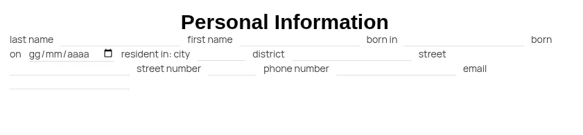
A widget can be thought of as a small application—for example, a form for entering personal data, or a checklist to inspect a piece of equipment.
A widget is made up of other widgets. Generally, we call the base widgets components, the building blocks available in the editor, but technically they are also widgets. By combining layout components, static components, and input components, we build our widget. The result is a tree of components/widgets nested within one another.
Creating a New Widget
Section titled “Creating a New Widget”To create a new widget, we start from the file system.
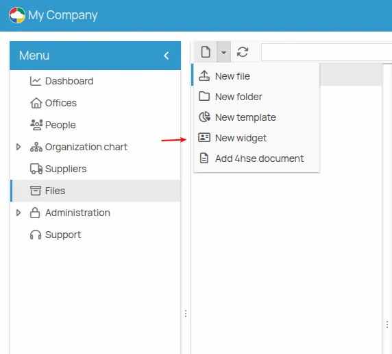
By selecting New widget, a window opens allowing us to create and edit the widget.
First, we must choose a base template. Currently, four templates are available:
- Blank template: contains only a layout component (more on this later)
- Vertical form: a template designed to easily create forms with input fields stacked vertically
- Inline form: a template meant for organizing content horizontally
- Form: an example template for building a checklist
Editing a Widget
Section titled “Editing a Widget”Similarly, to edit an existing widget, start from the file system, select the widget (with .hf extension), then click the pencil icon in the toolbar or right-click the widget and choose Edit.
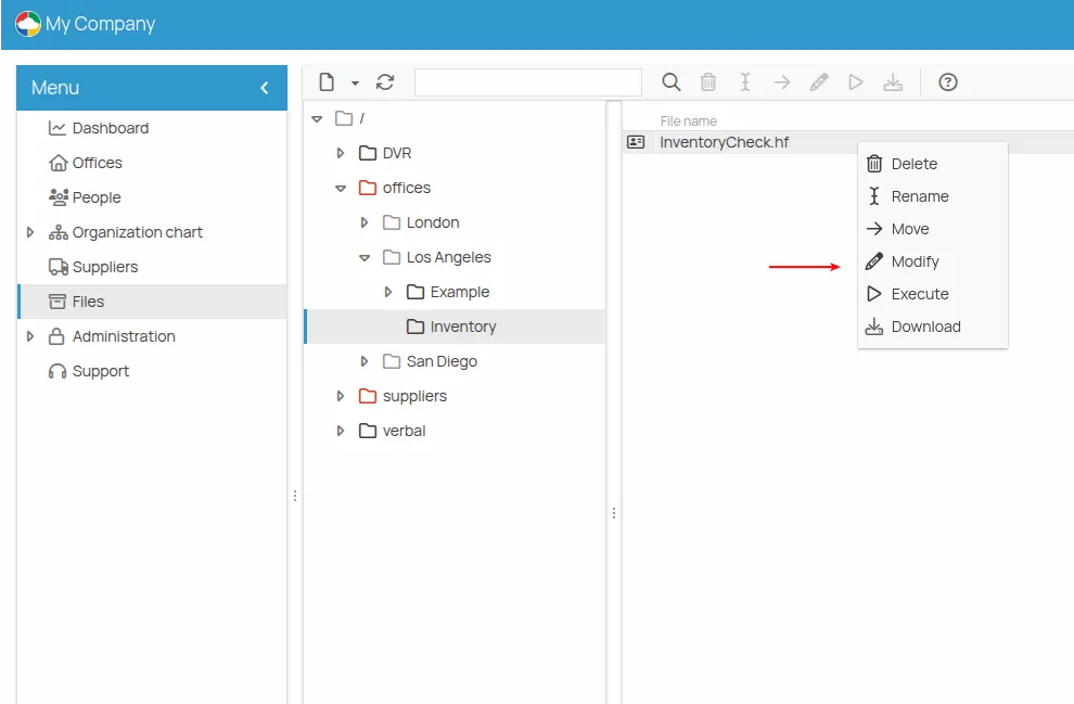
This opens the editor directly with the selected widget, ready for editing.
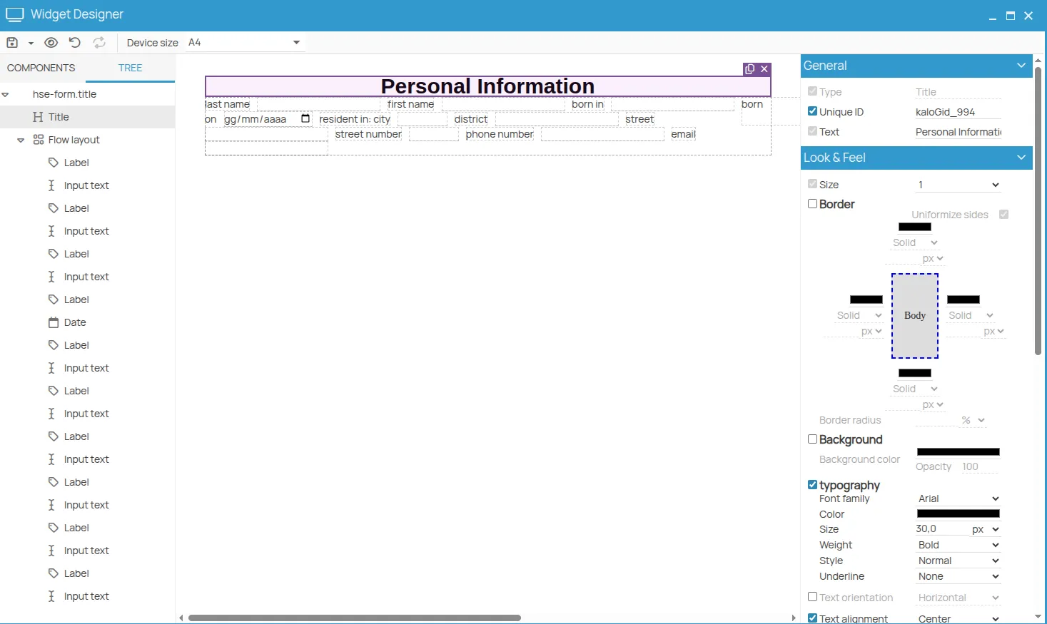
Editor
Section titled “Editor”Whether you’re creating a new widget or editing an existing one, you’ll be working in the editor.
The editor window contains several key areas:
Components
Section titled “Components”The left panel lists all available components that can be added to your widget (more will be added in future updates). These include:
- Labeled input: components with a label and an input field. Ideal for vertical forms.
- Basic input: plain input fields, useful for inline forms.
-
Static: non-interactive components like labels, titles, etc.
-
Layout: used to organize content visually (explained further below)
-
Snippets: reusable pieces of widgets
Also in the left panel, under the “TREE” tab, you can view your widget’s structure. This is useful to understand the actual layout of the widget you’re editing. Selecting a node in the tree also highlights it in the center preview and in the properties panel on the right. Selecting components is necessary to edit, delete, or duplicate them. Sometimes components are tightly packed, so selecting them from the tree is easier.
Preview – Center Panel
Section titled “Preview – Center Panel”The center of the editor displays a live preview of the widget. This graphical preview shows what the widget will look like in use. However, since this area is used for other tasks too, the preview may not be 100% accurate. Use the toolbar’s preview function for an exact result.
Hovering over a component highlights it and shows its type. Clicking a component selects it, which also updates the tree and the properties panel on the right.
Once selected, two icons appear: one to duplicate and one to delete the component.
Properties
Section titled “Properties”The properties panel is on the right. Each component has properties—for example, text size, margins, or an input’s default value. These are shown when the component is selected in the tree or preview.
Changes made here will immediately reflect in the preview (you may need to click elsewhere, like the white space or another property, for them to apply).
Each property can be enabled via its corresponding checkbox. If the checkbox is off, the component uses the default value. If it’s on, you can customize the property. This lets you tailor components to your needs.
Different components have different sets of properties.
Drag & Drop
Section titled “Drag & Drop”You can drag components in several ways:
- From the COMPONENTS panel to the preview area to add new elements exactly where you want them.
- Within the preview area to rearrange them. Holding the CTRL key during drag turns the cursor into a plus icon, meaning the component will be duplicated, not moved.
Layouts
Section titled “Layouts”Let’s take a closer look at layout components. These are essential for organizing your content effectively. Using them correctly saves time and gives precise control over layout; using them incorrectly can lead to frustration.
Inline Layout
Section titled “Inline Layout”This layout mimics word processor forms. Components are arranged side-by-side and wrap to the next line automatically when space runs out.
Only certain components can be displayed this way. Others, like titles or labeled inputs, will automatically break to a new line.
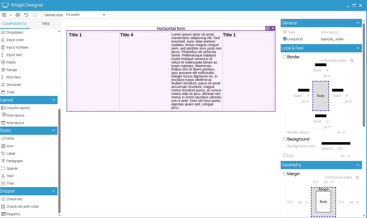
Horizontal Layout
Section titled “Horizontal Layout”This looks similar to the inline layout but offers more control. Components can be spaced evenly, centered, aligned to the right, etc.
Vertical Layout
Section titled “Vertical Layout”Components are stacked vertically. Ideal for simple forms or, when combined with horizontal layouts, for complex arrangements.
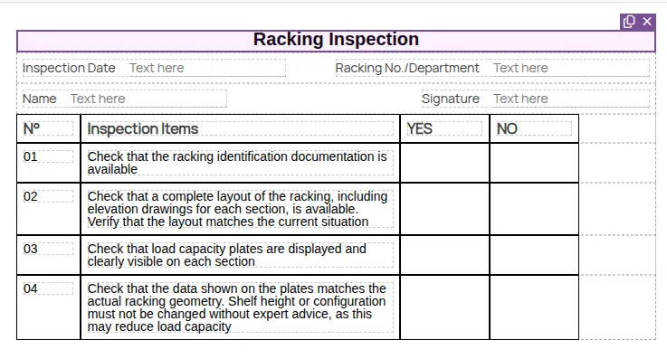
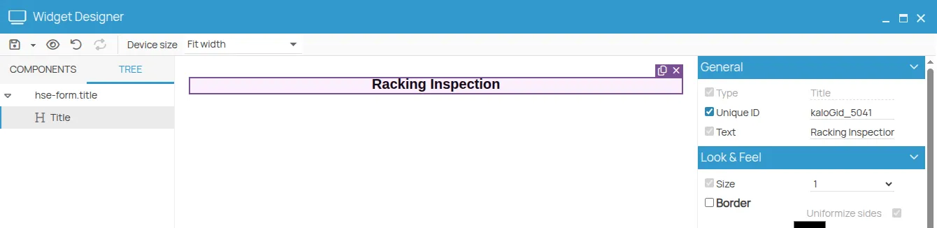
Example: Rack Inspection Checklist
Section titled “Example: Rack Inspection Checklist”Let’s create a checklist for inspecting storage racks.
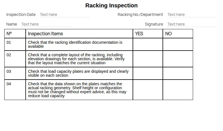
This form uses both vertical and horizontal layouts.
We first set the toolbar option: Device layout: A4
We started with a vertical layout and added a title.
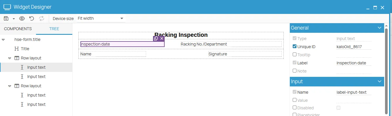
Next, we added two horizontal layouts and inserted text boxes from the labeled input components. To align the Inspection date and Name fields, we set the label width to 120px. To right-align the Rack No./Department and Signature fields, we set the layout property Spacing between items for both horizontal layouts.
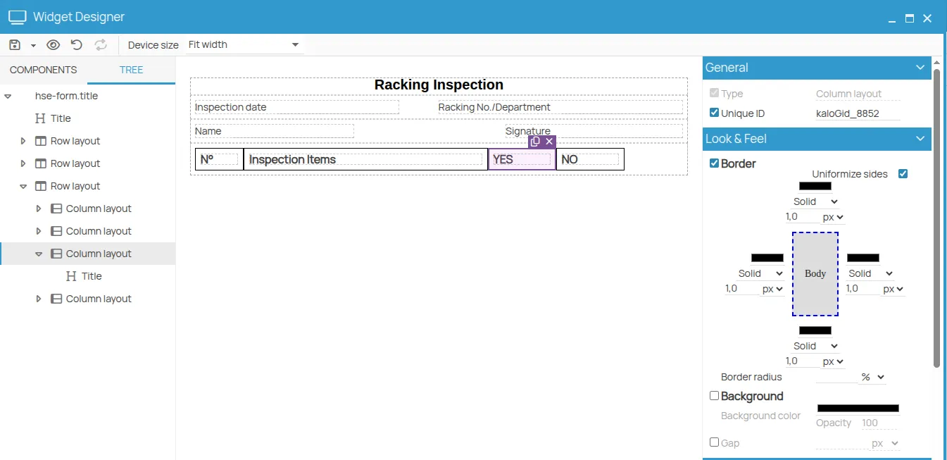
We then added another horizontal layout containing four vertical layouts. Each vertical layout contains a title with a description: No., Items to check, etc.
We configured the following:
- Horizontal layout padding: 0
- Vertical layout widths: 10%, 50%, 14%, 14%
- Disabled vertical layout height using the checkbox
- Vertical layout borders: Solid, 1px
- Title font size: 3
- Title font weight: Normal
We duplicated the horizontal layout.
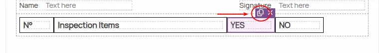
In the new row, we removed titles from the last two columns and increased the font size of the remaining titles from 3 to 4. Thanks to disabling the “Height” property earlier, these now appear as empty cells that still fill the vertical space. We duplicated this row three more times.
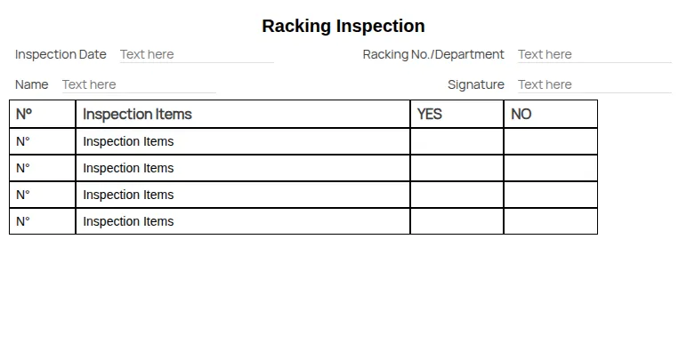
We then updated the titles and adjusted row heights to achieve the final design.